In Power BI, the « Waterfall » visual is used to display changes in a quantitative value over a sequence of categories. It is particularly useful for showing how an initial value is affected by various positive and negative factors, leading to a final total. The Waterfall chart is similar to a stacked bar chart, but it includes connectors that represent the cumulative effect of the individual values.

Example
To create a Waterfall visual in Power BI, you can use the « Waterfall Chart » visualization type and assign the appropriate fields to the « Category » and « Value » buckets in the chart properties.
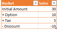
In this simple example we are going to consume below Data:
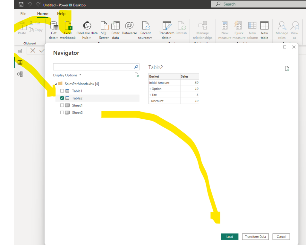
Prior to add the visual, please import the data as illustrated below:
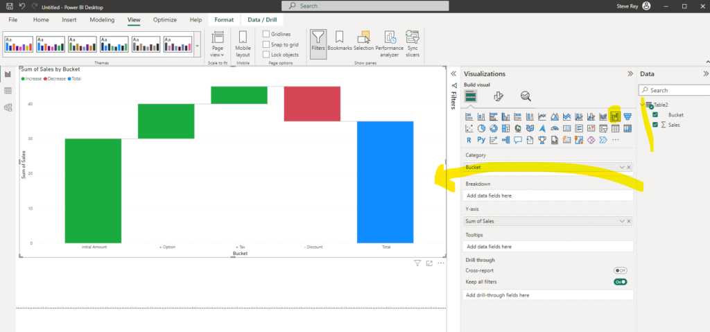
Now, you can add the « Waterfall » visual and drag the Bucket and sales values:
Scenarios
Here are some scenarios where using a Waterfall visual in Power BI can be beneficial:
- Financial Analysis: The Waterfall chart is commonly used in financial reporting to show the changes in revenue, expenses, or net income over time or across different categories.
- Sales Analysis: It is useful for analyzing the components of sales performance, such as the impact of different products, regions, or customer segments on the overall sales.
- Inventory Analysis: To show how the inventory levels change over time or due to different factors like production, sales, and replenishment.
- Budget Analysis: When comparing the actual budget with the projected budget, the Waterfall chart can visually demonstrate the variances.
- Profit and Loss Analysis: To illustrate the profit and loss contributions of different business segments or departments.
- Project Progress: It can be used to visualize the progress of a project over time, breaking down completed tasks and remaining work.
- Cohort Analysis: For showing how different cohorts evolve and contribute to the overall performance.
Remember, the Waterfall chart is most effective when you want to emphasize the cumulative effect of each component and how they lead to the final value. However, it might not be suitable for displaying large datasets with many categories, as the chart can become cluttered and less informative in such cases. Always ensure the chart is easily interpretable and meaningful to your audience.
Find more information in Microsoft Learn
Waterfall charts in Power BI – Power BI | Microsoft Learn