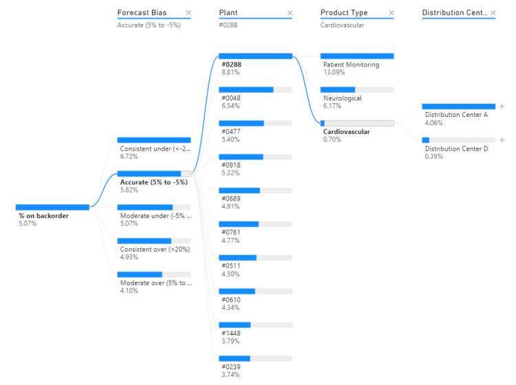
A decomposition tree is a powerful visualization tool in Power BI that allows users to break down a measure (numeric value) into its contributing factors in a hierarchical manner. It’s particularly useful for understanding the key drivers behind a specific metric and gaining insights into the data at different levels of granularity.

Example
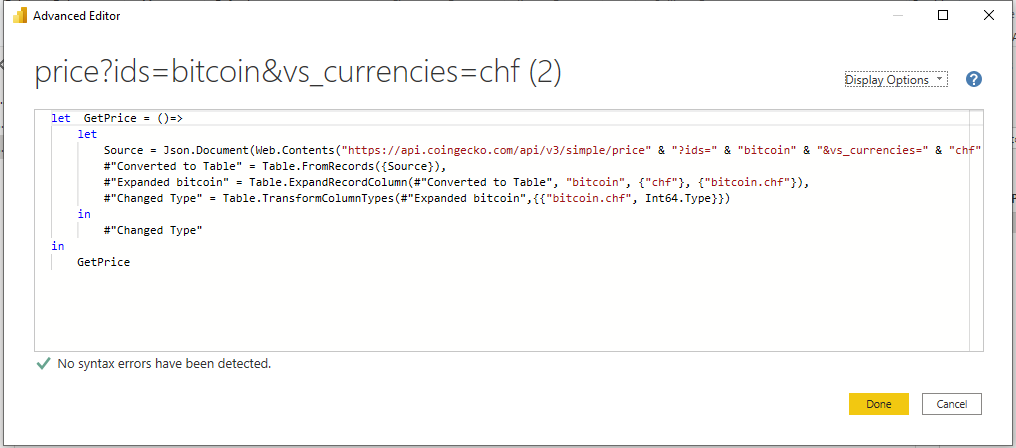
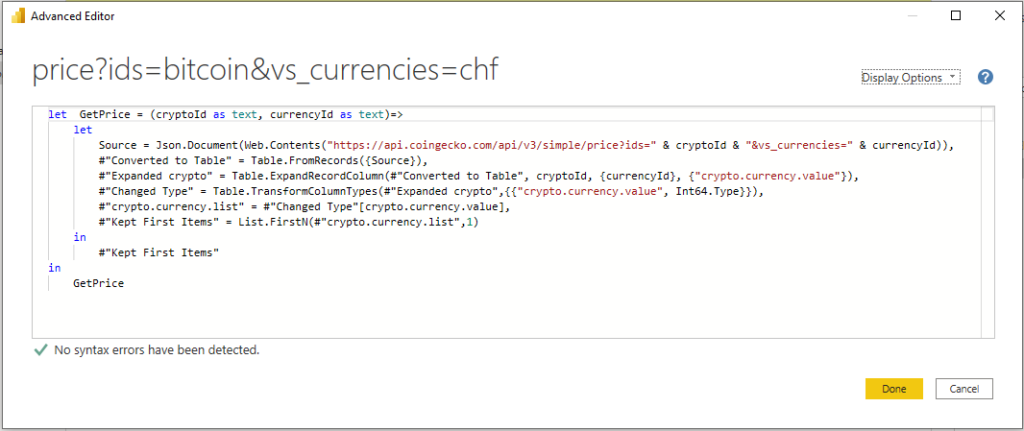
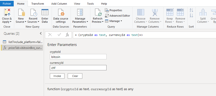
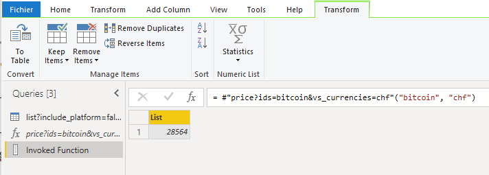
To create a Decomposition Tree visual in Power BI, you can use the « Decoposition Tree » visualization type. Once you drag your measure into the field well, the visual updates to showcase the aggregated measure.
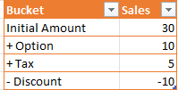
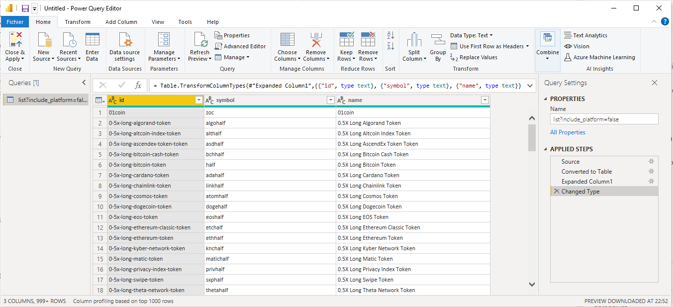
In this simple example we are going to consume below Data:
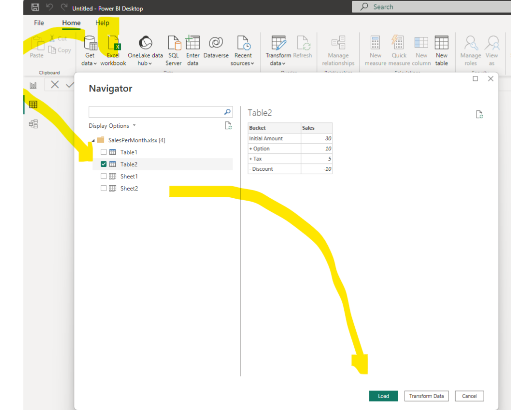
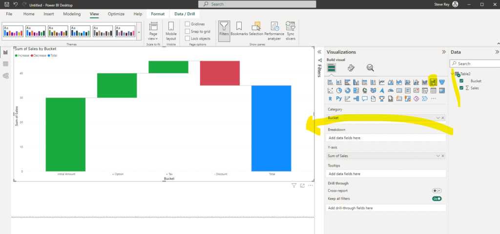
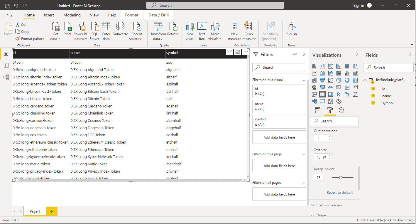
Please find below some example of implementation:
Scenarios
Here are some scenarios where using a decomposition tree in Power BI can be beneficial:
- Root Cause Analysis: When you want to identify the root causes of a particular metric’s performance, a decomposition tree can help you visualize the different factors influencing that metric. For example, understanding the key drivers behind a decrease in sales or an increase in customer churn.
- Exploratory Data Analysis: If you have a dataset with many dimensions and measures, a decomposition tree can assist you in exploring and understanding the data structure more easily. It can reveal patterns and correlations in the data that might not be immediately apparent in traditional visualizations.
- Performance Evaluation: In situations where you want to assess the performance of different groups, products, or regions, the decomposition tree can break down the overall metric into subcategories, allowing for quick comparisons and identifying areas of strength and weakness.
- Forecasting and Budgeting: When preparing budgets or forecasts, the decomposition tree can help in understanding historical trends and contributions from different factors, aiding in making more informed projections.
- Customer Segmentation: For marketing or sales analysis, the decomposition tree can be used to segment customers based on their attributes and analyze how different factors impact their behavior or spending patterns.
- Process Optimization: In business process analysis, the decomposition tree can be used to identify bottlenecks or inefficiencies by breaking down metrics related to the process steps.
- Supply Chain Analysis: For supply chain management, the decomposition tree can help in understanding the cost breakdown or inventory flow through various stages.
Overall, the decomposition tree is an excellent option when you want to dive deeper into the data to understand the underlying drivers of a specific metric. It allows you to interactively explore and analyze data at multiple levels, making it easier to grasp complex relationships and gain valuable insights. However, be cautious about using it with very large datasets, as the visualization can become overwhelming and less effective.
Find more information in Microsoft Learn
https://learn.microsoft.com/en-us/power-bi/visuals/power-bi-visualization-decomposition-tree